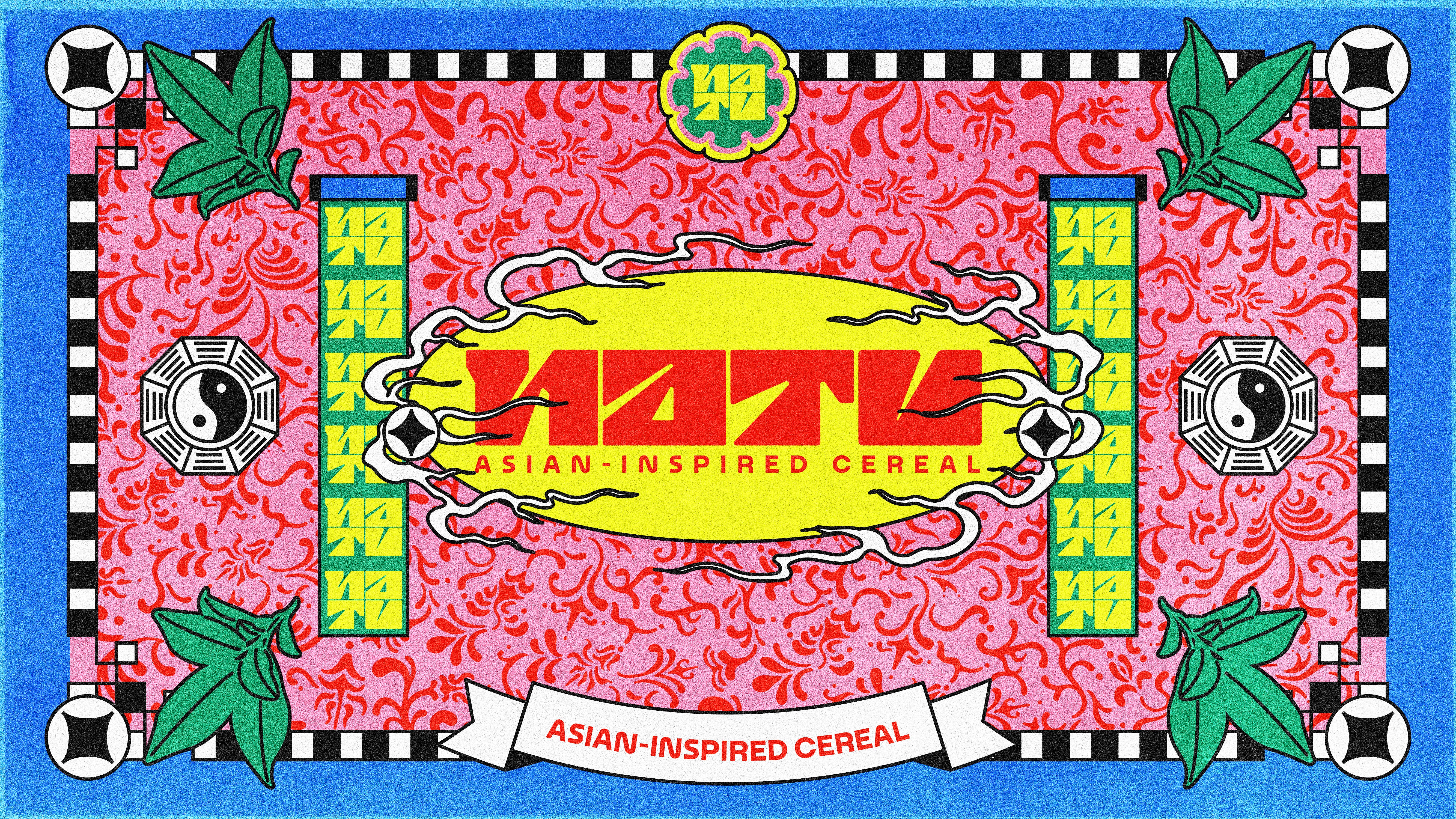
NATU
ROLECreative/Art Direction
Branding & Identity
Packaging
Illustration/Pattern
3D
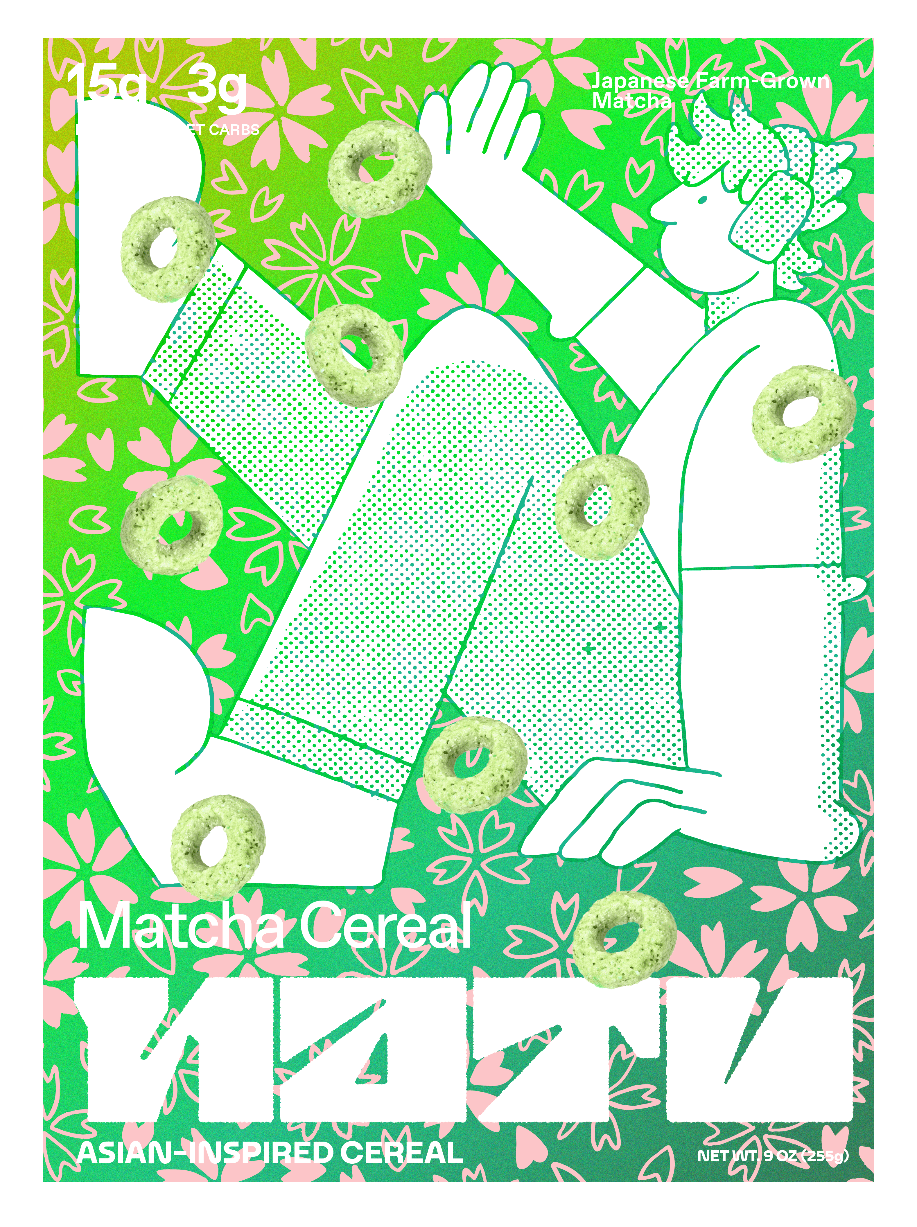
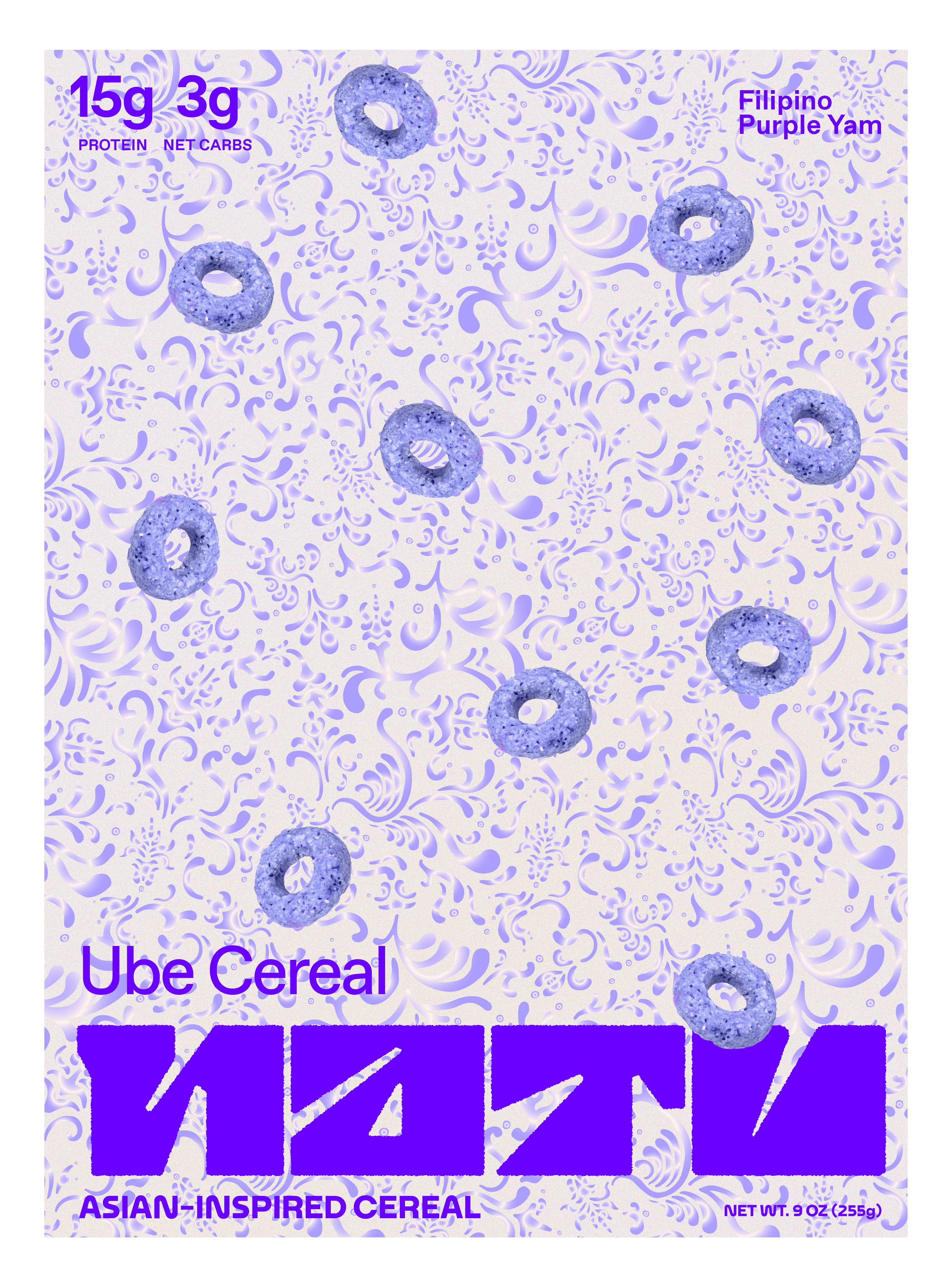
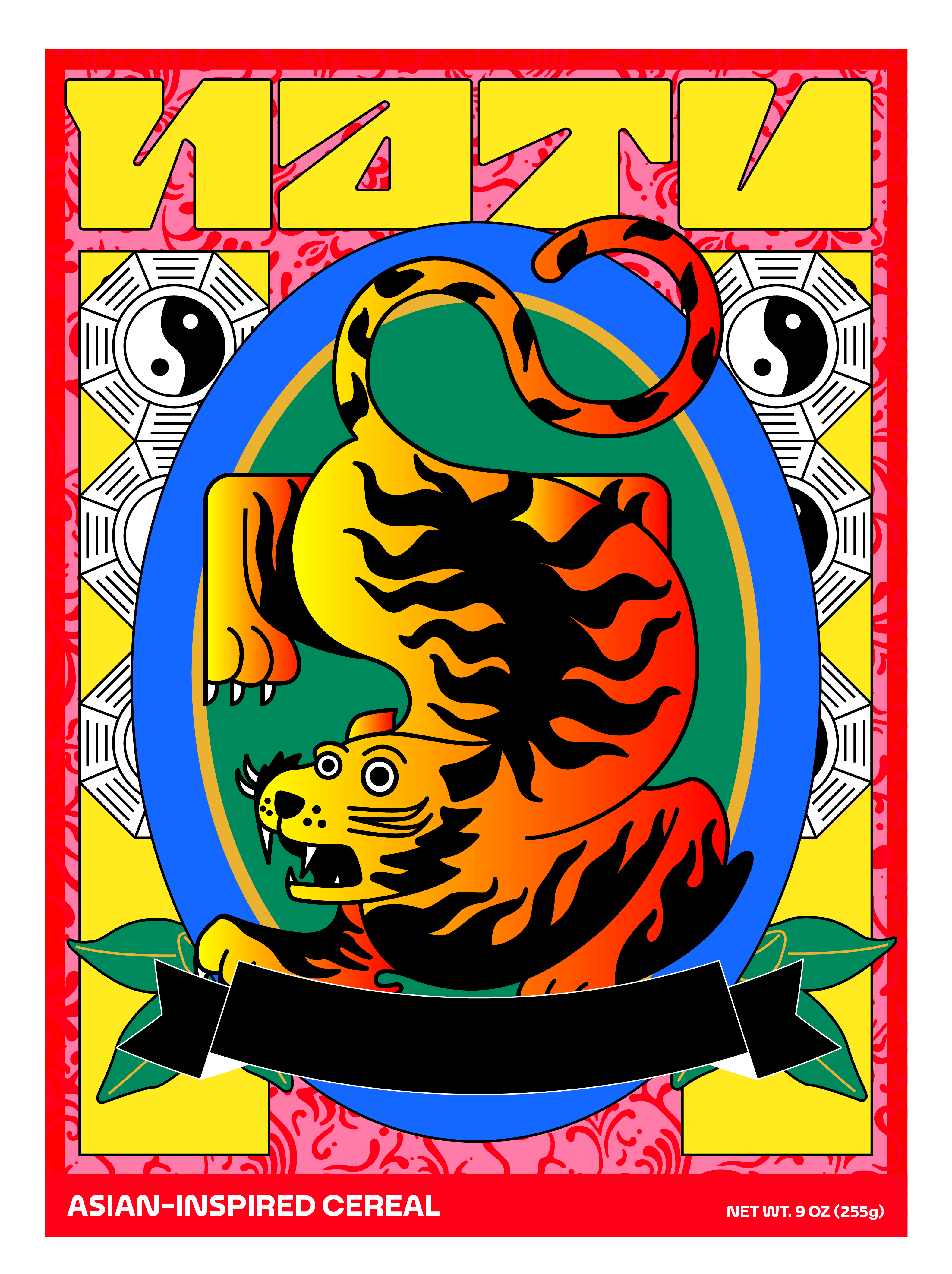
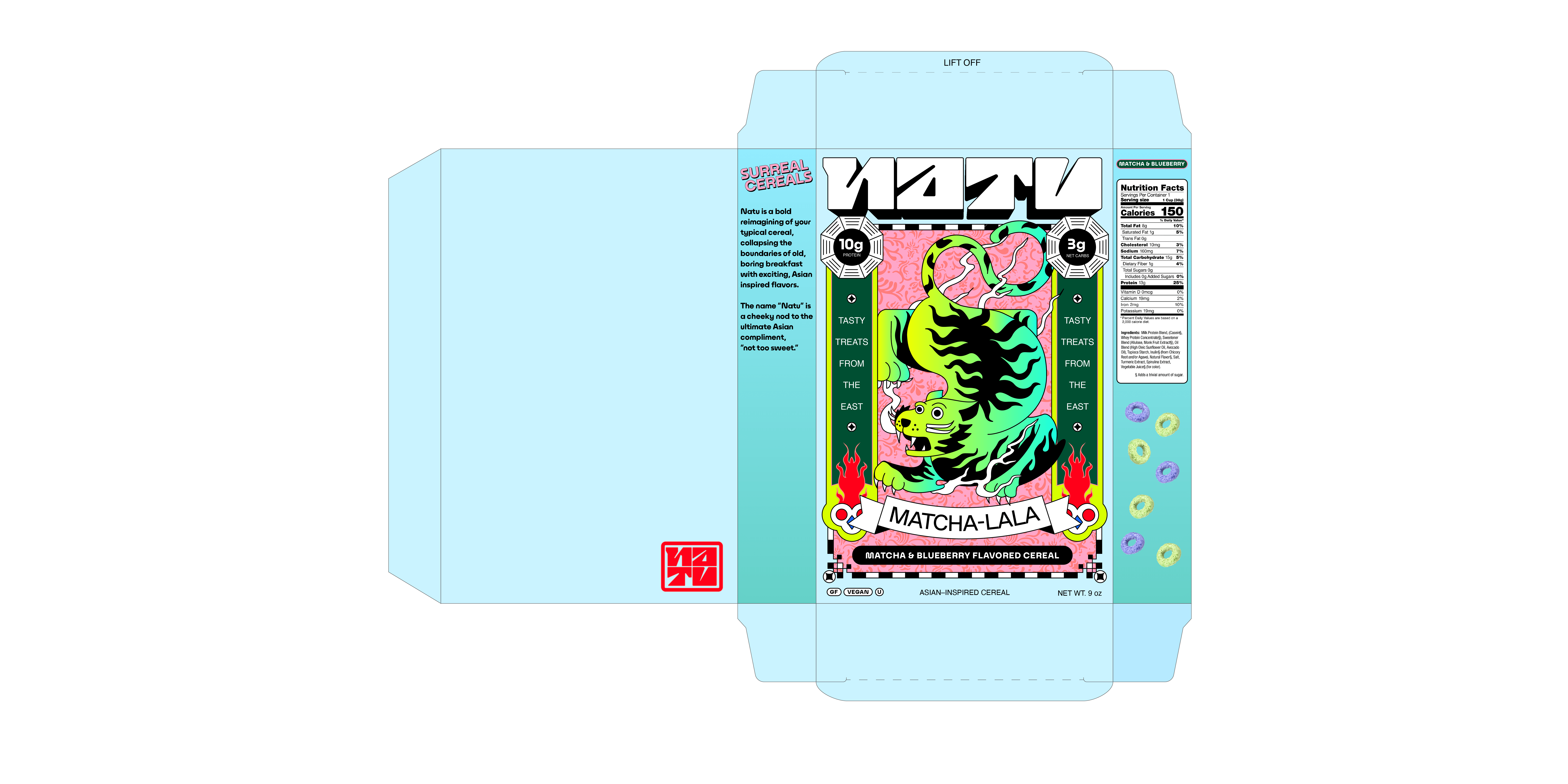
Natu is a bold reimagining of your typical cereal, collapsing the boundaries of old, boring breakfast with exciting, Asian-inspired flavors. The name “Natu” is a cheeky nod to the ultimate Asian compliment, “not too sweet.”
This conceptual brand was inspired by my first recollection and interest in graphic design. I loved going to the Asian supermarket with my parents as a child and I would admire the colorful (and charmingly cluttered) packaging design of snacks, drinks, and candies. I wouldn’t say I have a “style” but the influence is apparent over the scope of my work. So, I wanted to make a project dedicated to not only show my capabilities and process as a designer but also pay homage to what got me here.
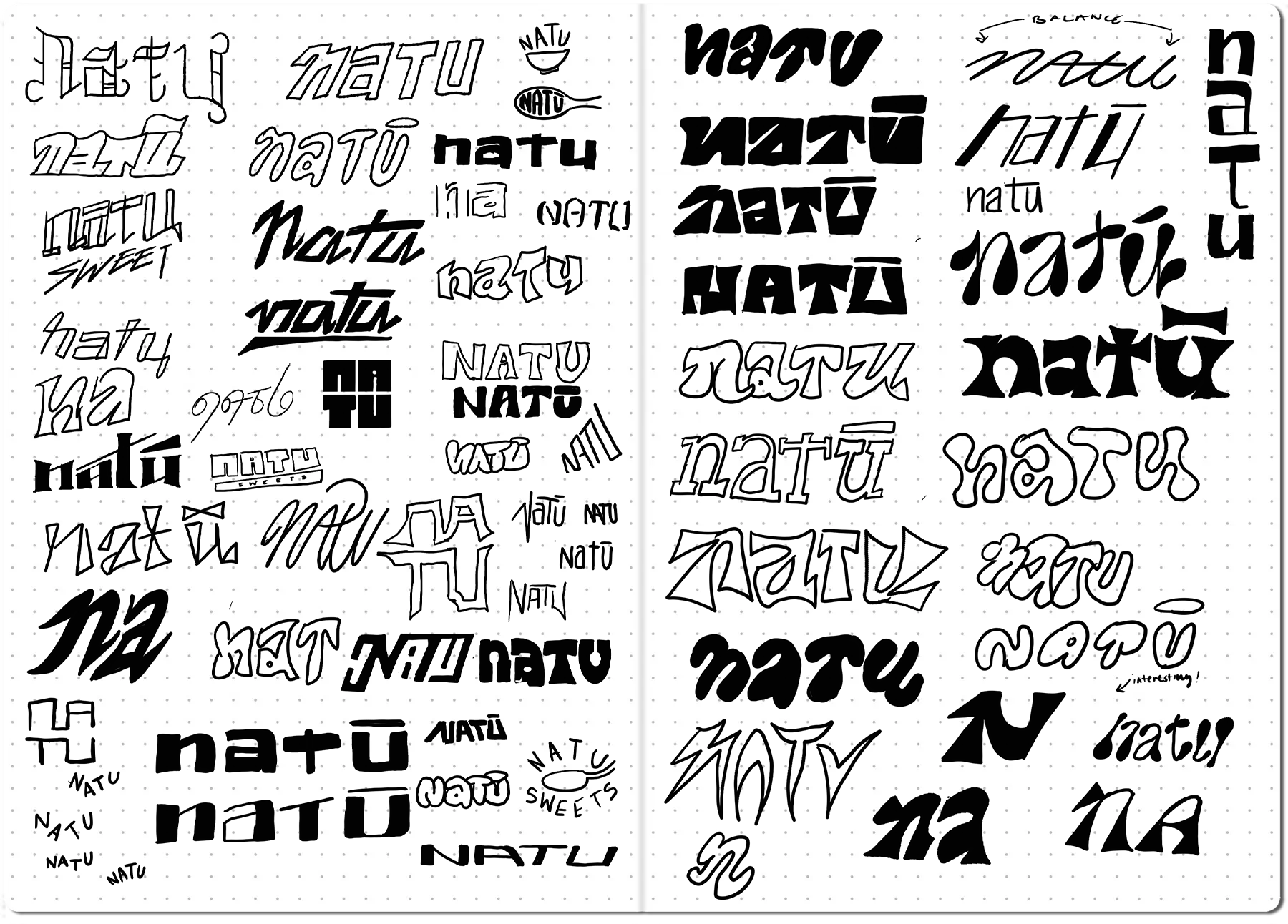
LOGO PROCESS


BRANDING
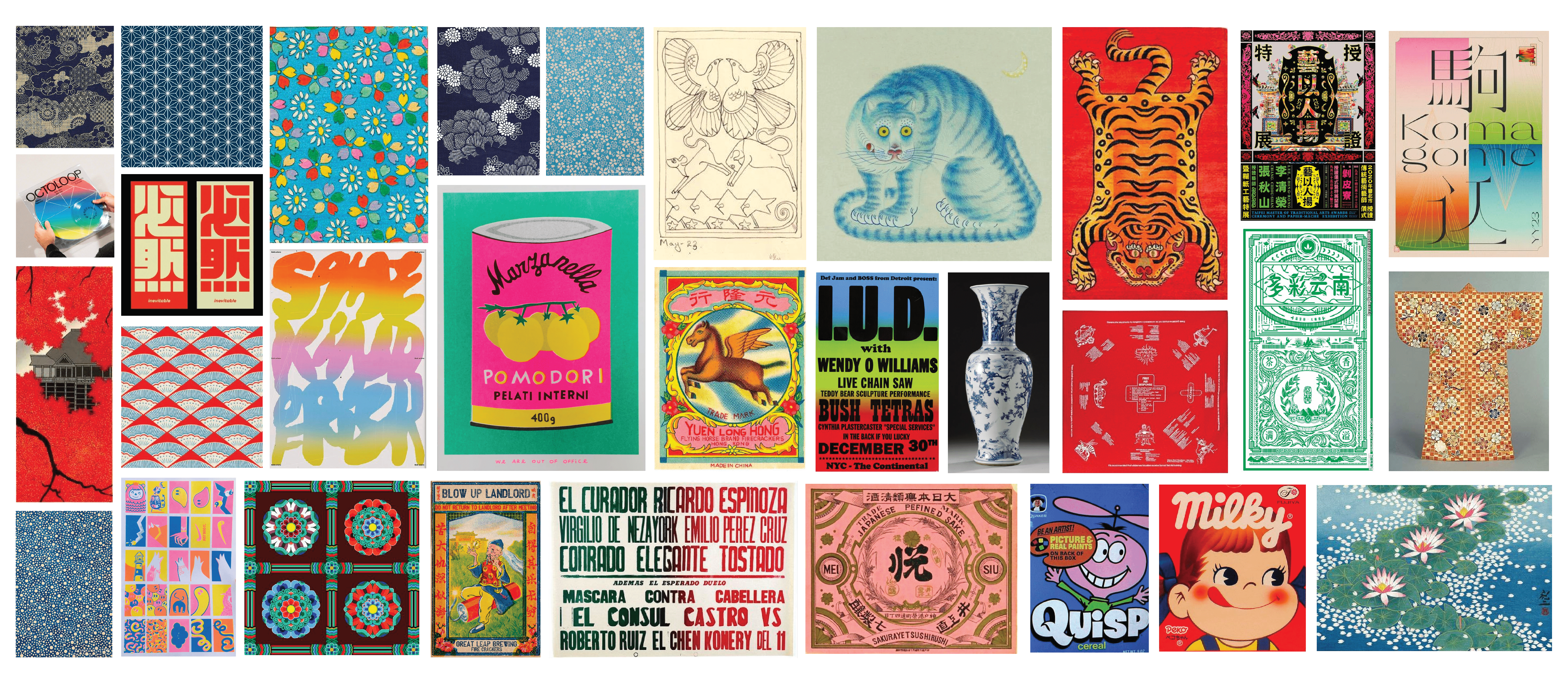
TYPOGRAPHIC SELECTIONS, ART DIRECTION SELECTS
PACKAGING


